Design Feature #19
Sitting Loudly: Nendo’s 50 Manga Chairs
nendo
Since thousands of years ago, the general form of the chair has rarely changed: a simple, moveable seat often accompanied by a sturdy back. The back of course, is essential. Remove it and the chair becomes a stool – a sort-of-chair but not the sort we’re talking about today. A chair is, in its simplest of forms, a series of lines that have been put together.
Japanese design group nendo decided to reinterpret the humble chair by referencing one of Japan’s oldest art forms: manga. “50 Manga Chairs” was one of the many projects the prolific design studio presented at Fuorisalone, one of the most important design events in Milan Design Week (and some say, the world!). The exhibition was commissioned by New York gallery Friedman Benda, which has made a name for itself representing designers who create art that ranges from the interesting to extraordinary.
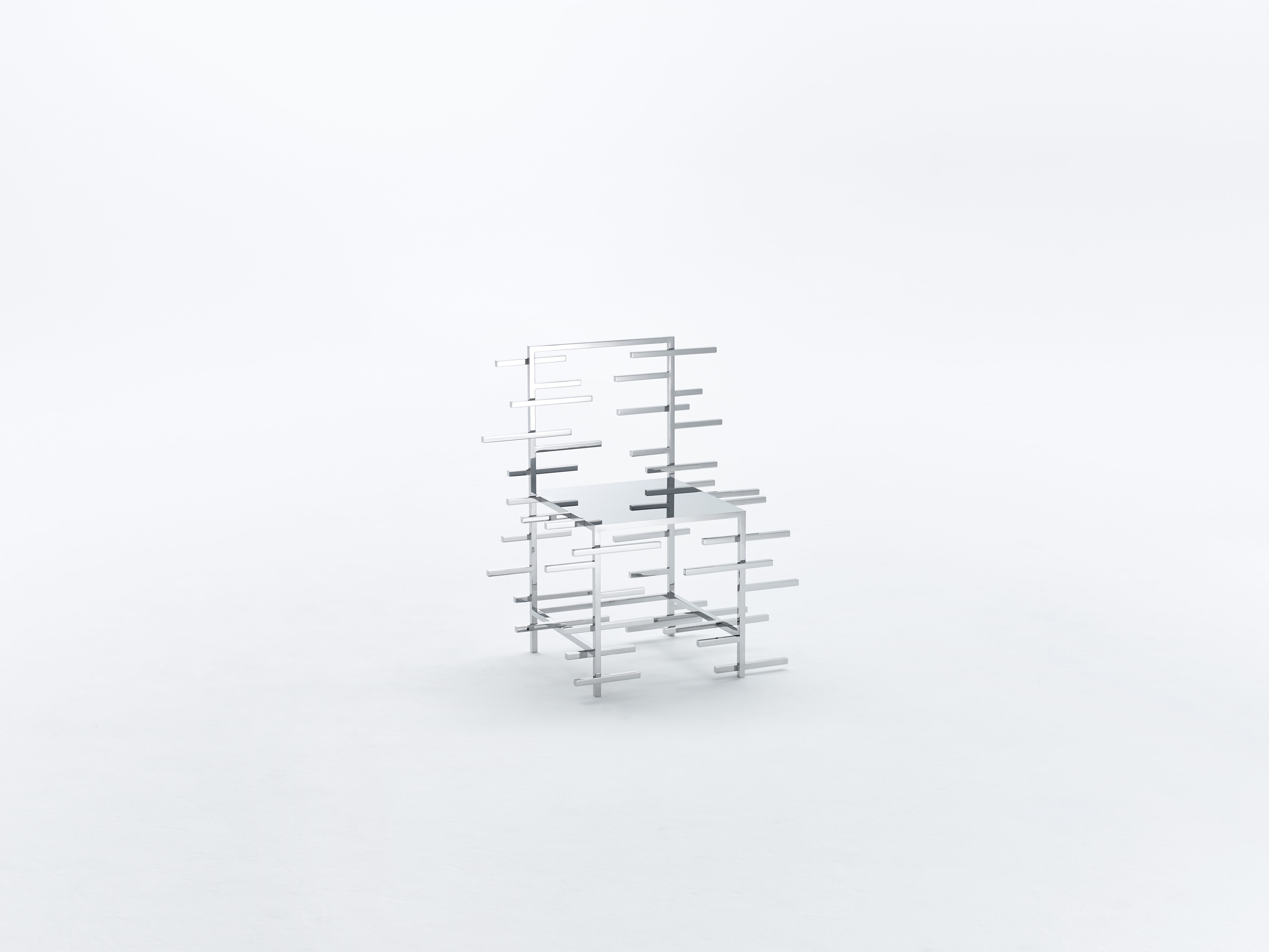
So it’s no surprise that “50 Manga Chairs” is both extremely interesting and wonderfully extraordinary. The exhibition takes inspiration from the centuries-old art form of manga, which boasts influences from Edo-period Ukiyo-e (woodblock) prints. These days, manga is known for its varied themes and art styles, and its tremendous influences on designers around the world. Its versatility lies in the fact that every panel and every page can convey so much, due to its high degree of flatness and abstraction.
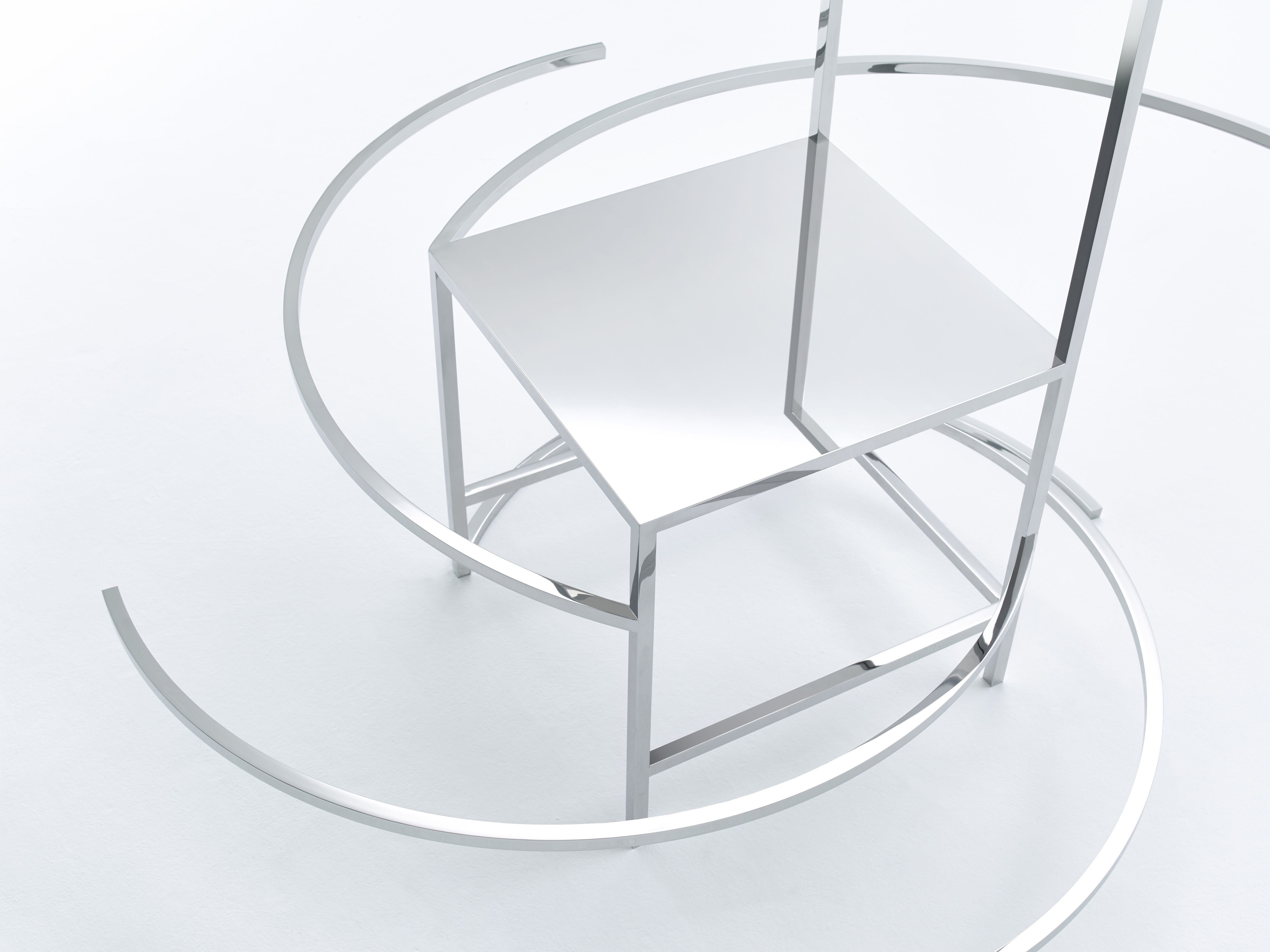
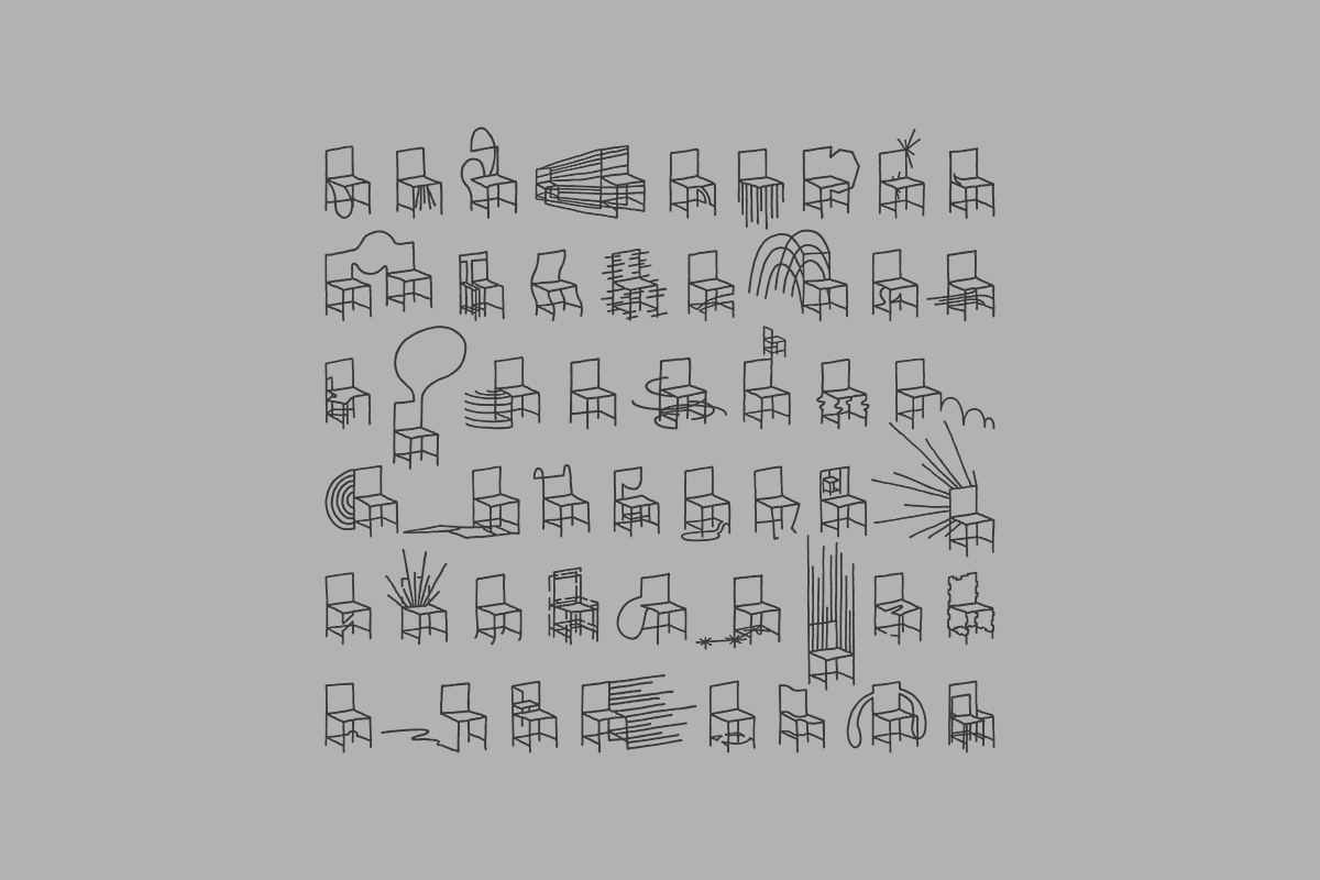
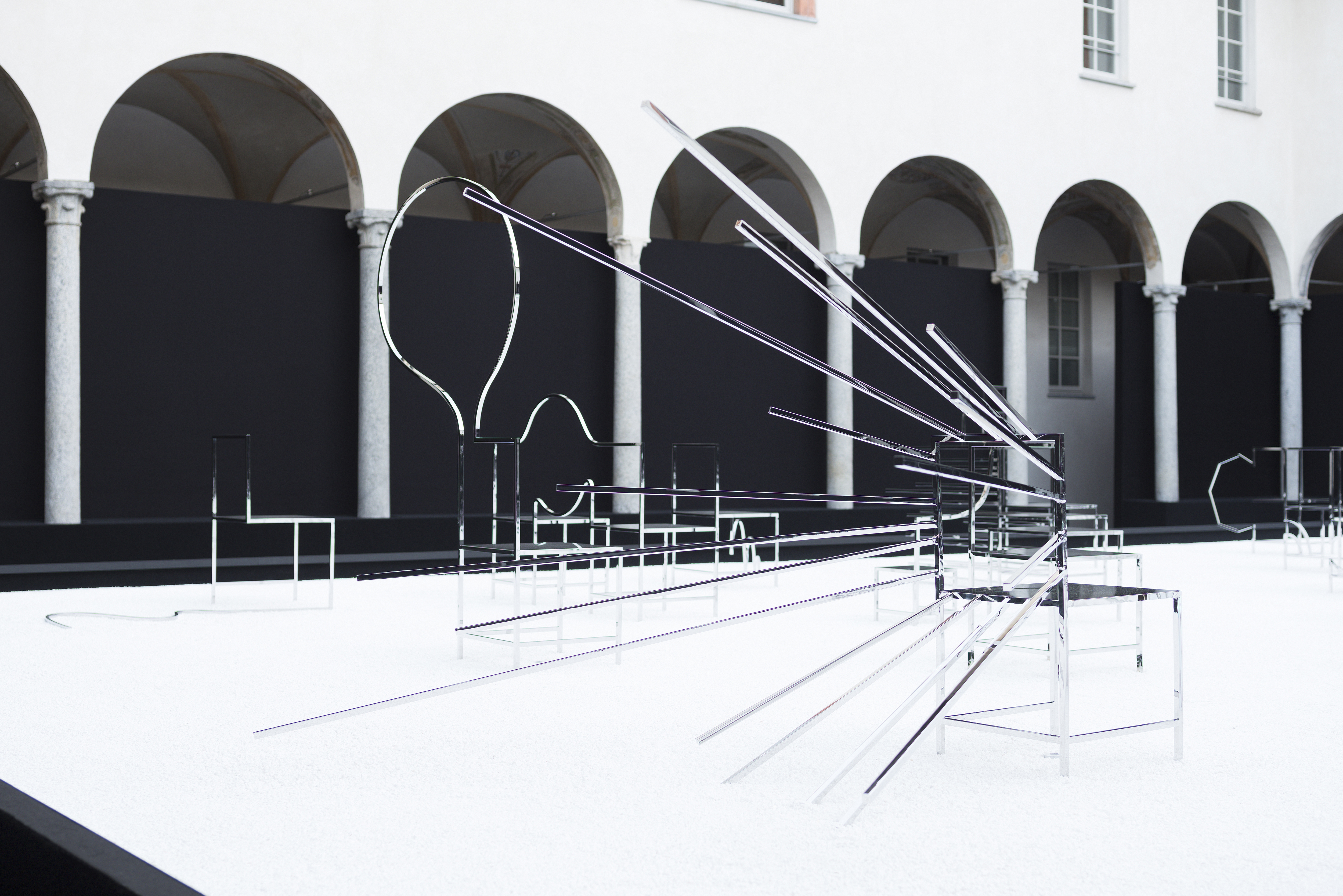
nendo's “50 Manga Chairs” starts out with the same idea as manga and attempts to distill manga expressions and motifs into a series of lines. Each chair embodies the same playful aesthetic that nendo is known for, as well as the vibrant nature of manga.
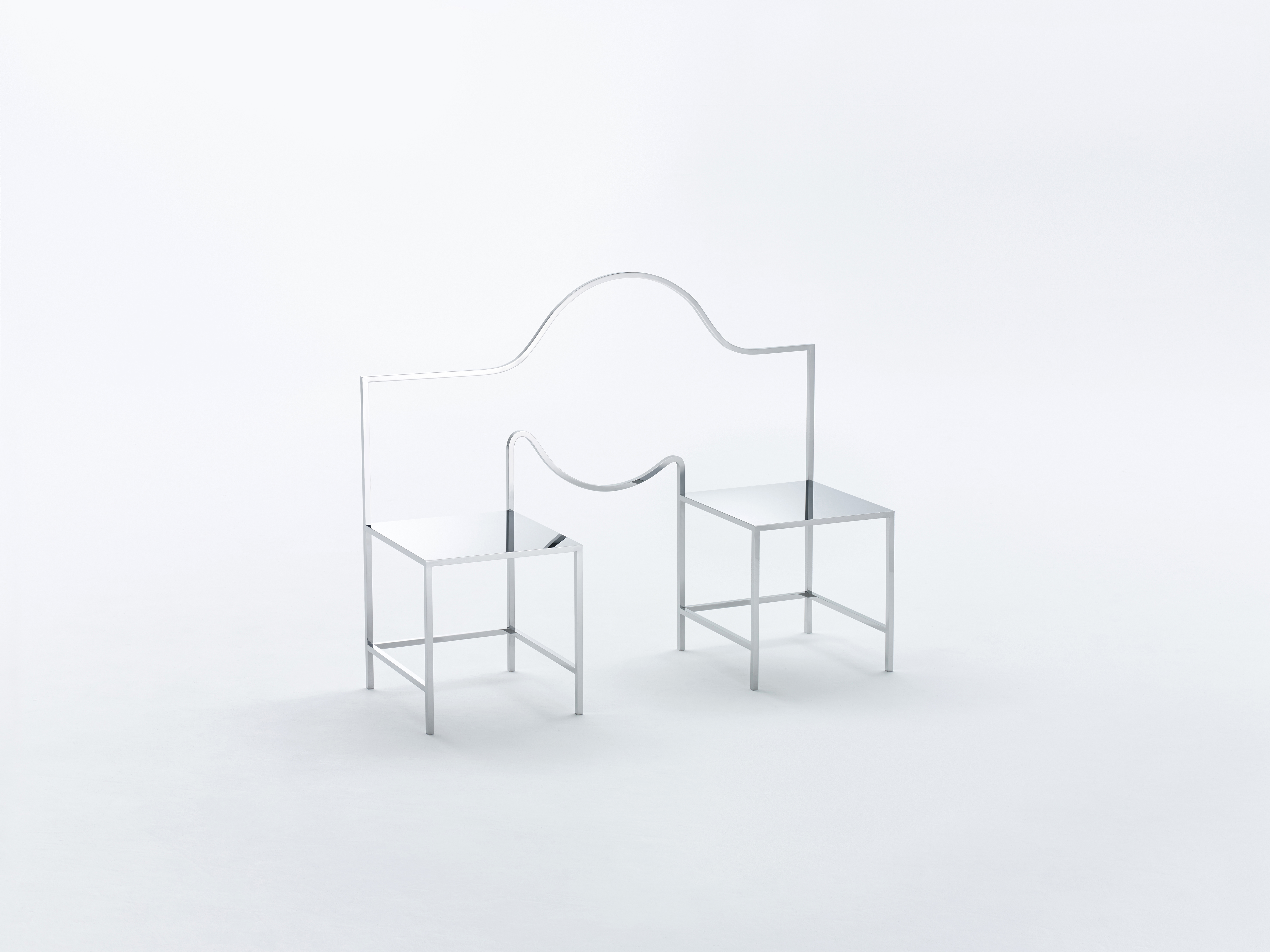
The project becomes even more poetic when you think about how manga is meant to be ‘read’ across a series of panels. nendo decided to line each of the 50 chairs in a grid, allowing viewers to enjoy a self-contained story in each ‘panel’, or create their own stories from any series of chairs. Each chair expresses a particular manga sound, action or symbol “so that a sense of story and character can be felt”.
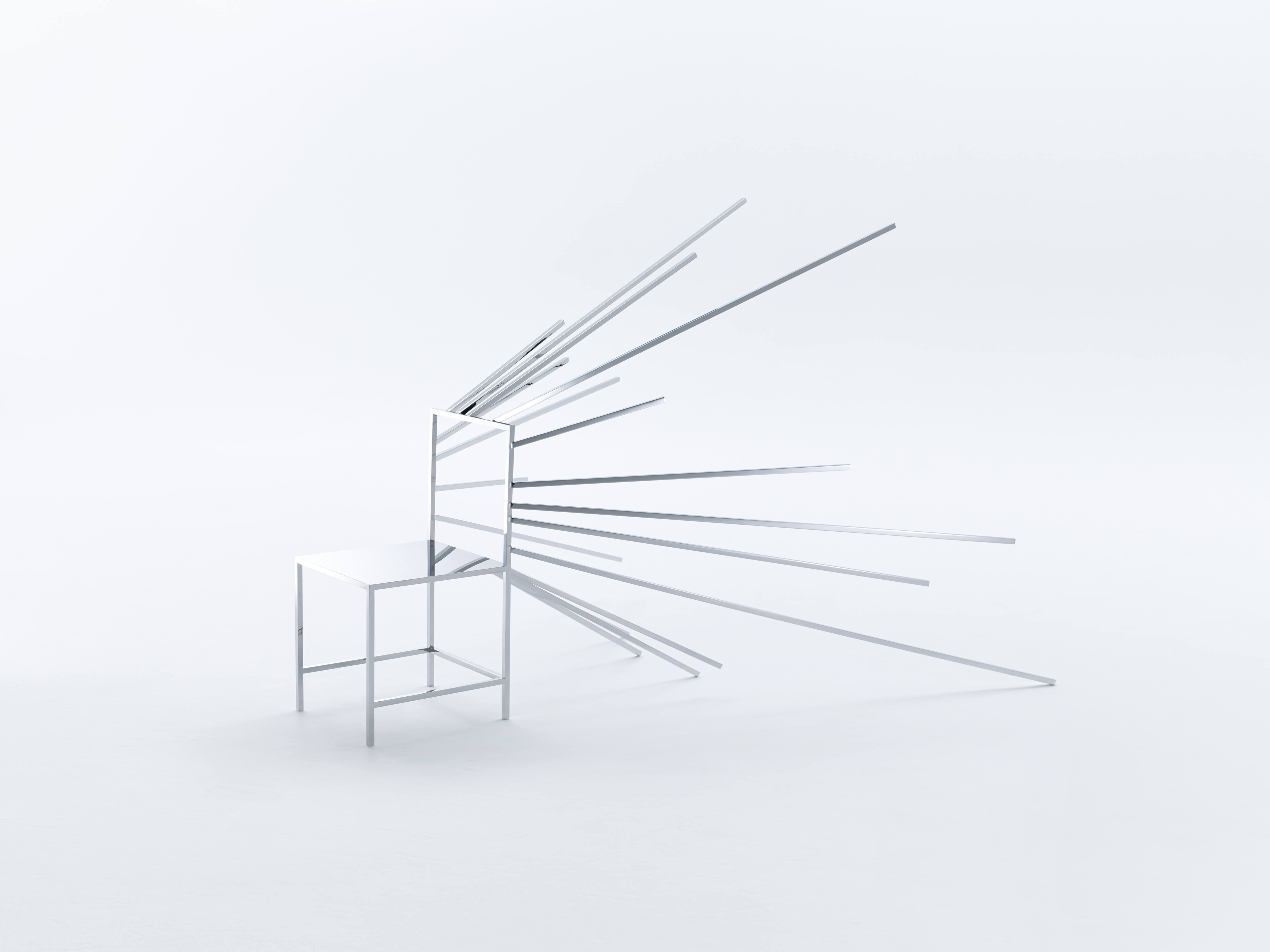
Furthermore, nendo avoided using distinct colours or textures for the chairs, opting to let the form speak for itself as much as possible. A mirror-like finish was chosen which not only “generates new spatial layers” but also hint at how manga reflects the real world as well. At some angles, viewers can also imagine themselves ‘in’ the world of these Manga Chairs.
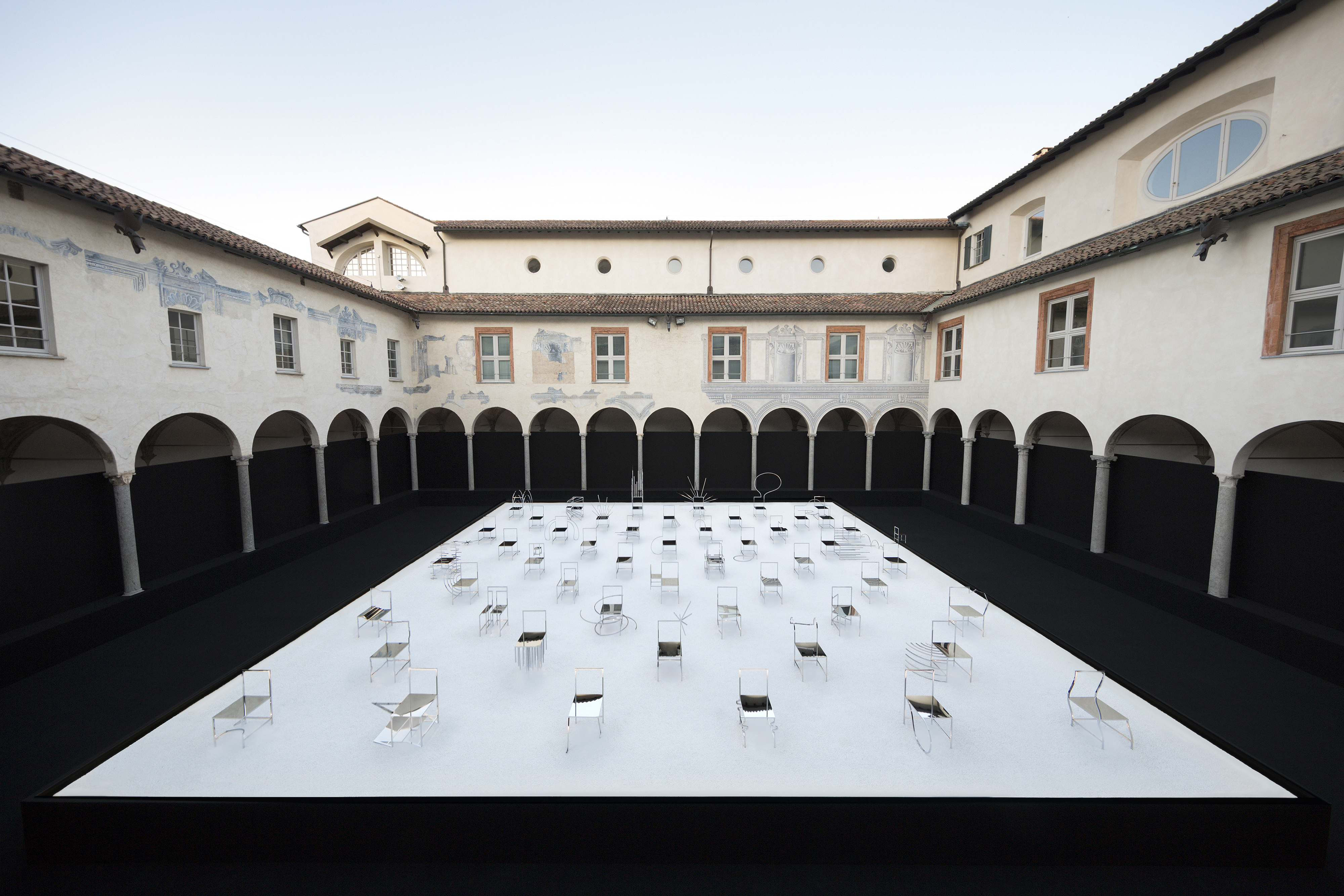
The juxtaposition of what a chair is usually associated with – sitting, static, non-movement, relaxing – and what manga promises – exaggerated movement, heightened emotions and plenty of action – is extremely compelling. Don’t be surprised if you find yourself drawn into its stylized world. In a way, nendo’s project acts as a bridge between art and manga, marrying the ‘pop’ aesthetic of manga and the restrained elegance of contemporary furniture design.
The exhibition will travel to Friedman Benda’s New York flagship space in September 2016.
Friedman Benda’s New York flagship space Exhibition Information

