Design Feature #47
It’s no longer an idle dream to making the world a better place
KOKUYO Design Award

Text & Photo: Midway
Action speaks louder than words. The old and established Japanese stationary brand KOKYUO believes that in order to achieve one’s dream, taking action is the key to success, thus since 2002, they have been organising the KOKUYO Design Award to actively invite participants to submit works that help improve our lives. The winning works will then be produced into commodities.
‘Universal Design’ – products that are users oriented, simple and practical are only some of the philosophies deeply rooted in KOKYUO, brining joy to users is the ultimate goal they are committed to achieve. The annual KOKUYO Design Award is a platform that turns dream into reality, inviting people to submit and realise their works. Whether it’s stationary, houseware and tool, all entries shall be designed based on the theme of that year, and the shortlisted works will be awarded to create into mock-ups. Hence, there is a high possibility for most of the awarded works to be realised into commodities, such as the best sellers Kadokeshi Plastic Eraser, Disappeared Calendar and Beetle Tip 3-way Highlighter.
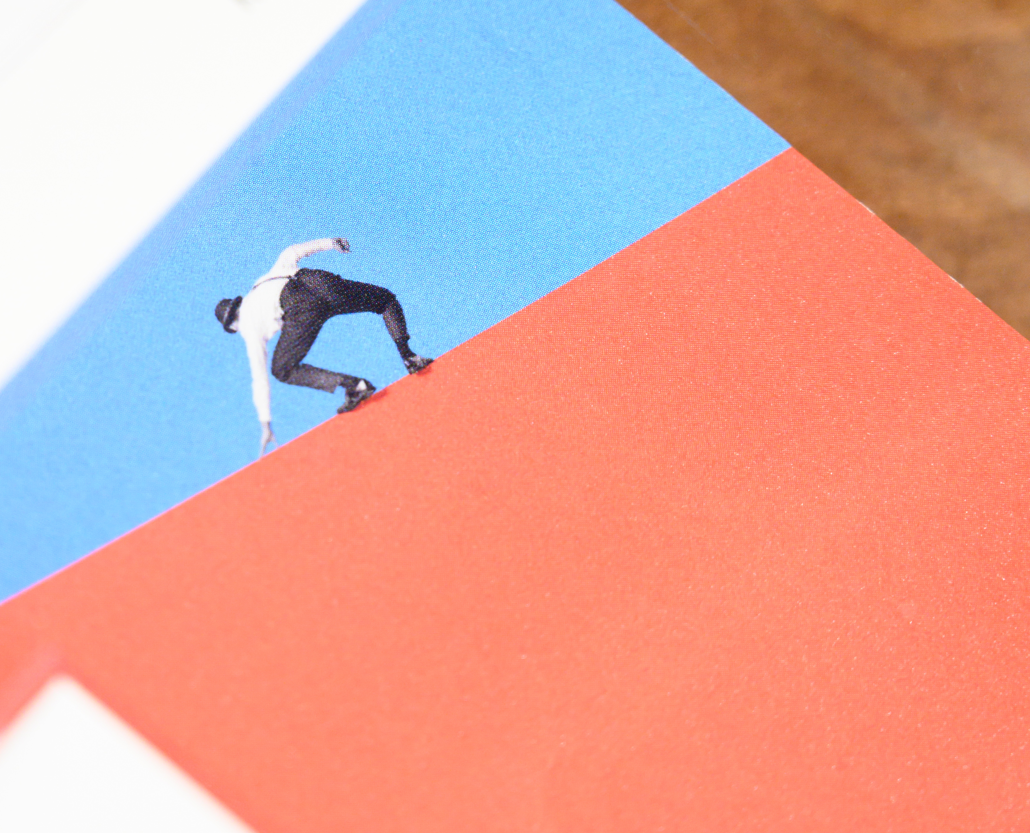
The theme of KOKUYO Design Award in 2018: BEYONG BOUNDARIES and the poster.
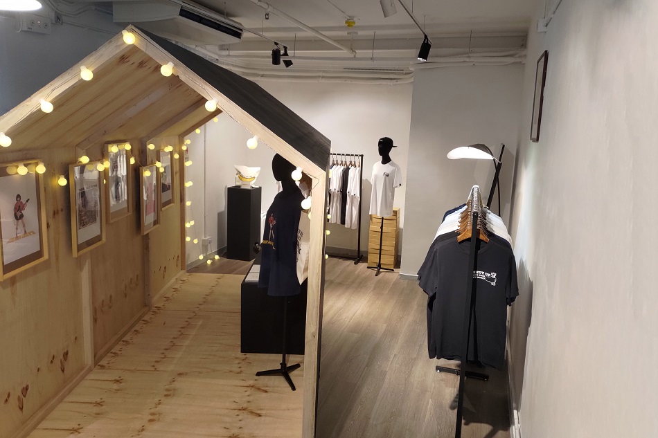
Currently in Hong Kong, the annual KOKUYO Design Award is presenting four winning works of 2018 together with a number of remarkable ones. These designs worked around the theme – BEYONG BOUNDARIES – revealed the key messages of the judging criteria and design thinking of the awardees. A poster where 80% is covered in red, a tiny figure seems to be just crossed over a tall wall to a world of uncertainty – vividly answering to the theme in breaking the existing boundaries, allowing thoughts to be freely expressed in the society.
Among all works, the most representative is the winner of GRAND PRIX – Sound of Drawing. Sound of Drawing is a work that amplifies the sound of writing when the pen point is touching the paper, creating a new sensation besides visual that one would not normally expect. Many people were moved after trying it as they were like composing a music whilst writing. Renowned Japanese designer Oki Sato, one of the judges of the award, commented that the work not only was the best example of thinking out-of-the-box, but easy to produce too. The shapes and colours chosen were well considered in great details, which were loyal to the original design thinking. Realising a design product that ticks all the boxes is also what KOKUYO always wanted to achieve.
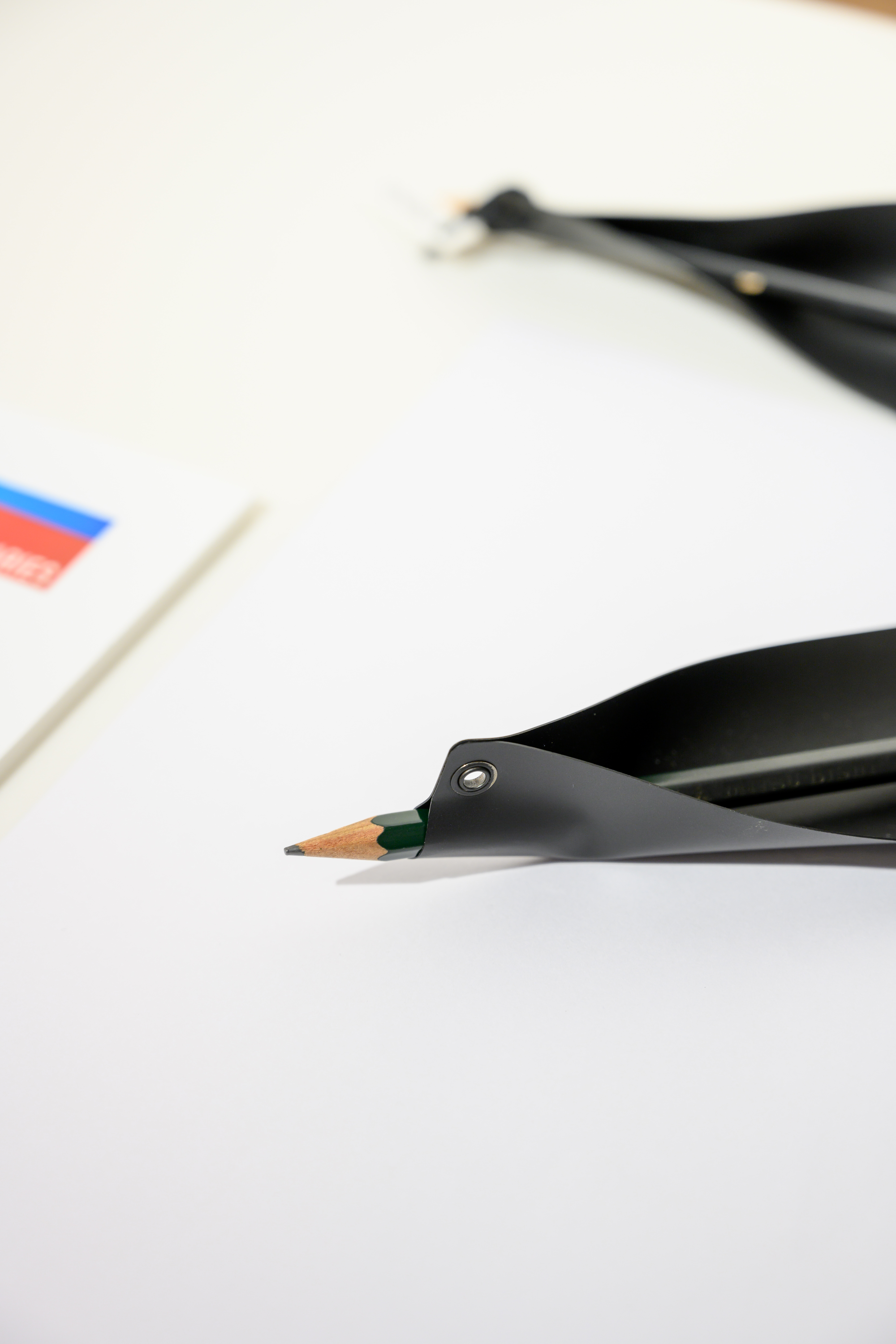
The winner of GRAND PRIX – Sound of Drawing.
The winner of GRAND PRIX – Sound of Drawing.
Another three works that won the merit awards shows the diversifications a design can be achieved. Targeting different groups of users, the presentations and functions of the designs are apparently different. The drawing tools ‘Palletballet’ was an idea came up by the Indian design team who brought the norms from local to global: colours, stories and characteristics of the drawing tools. One of the essentials of good design is easy to be understood. Palletballet is user friendly as no instructions are needed even for children. The shapes of each tool already inform the usage of itself. Children can enjoy a colourful journey once they start to use the tools. This design once again expands people’s imagination and encourages others to do things inventively.

The drawing tools "Palletballet"
The work Smart Double Clip prompts me to ask why such great design only came up now but not earlier. Undoubtedly, there is always a blind spot for things that have become our daily necessities or behaviours as we are so used to. Finding ways to improve a design that was born hundred years ago is never easy. Improving the design of the binder clip was the goal of Smart Double Clip. By just one small step – cutting out the small edges of the clip – the clip has become more user and environmentally friendly as less material is used, truly an out-of-the-box design.
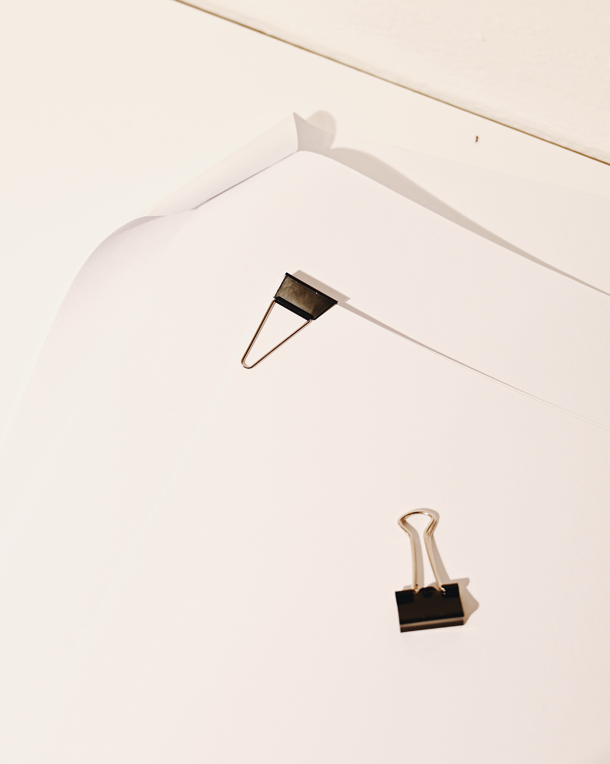
Smart Double Clip
Last but not the least, the merit award the Monochrome Notebook best demonstrates the beauty of creating good design through observation and study. By looking at its appearance, Monochrome Notebook is nothing but an ordinary notebook; however, the design helps readers more focused on reading with the monochrome paper – merely employing the same concept of using highlighter to emphasize the line one’s wanted to focus on. By drawing contrast with colours, this also assists people who are visually impaired to read too. The visual limitations of human aspired the design of Monochrome Notebook, creating a completely new concept for design that an ordinary thing such as a notebook could also achieve.
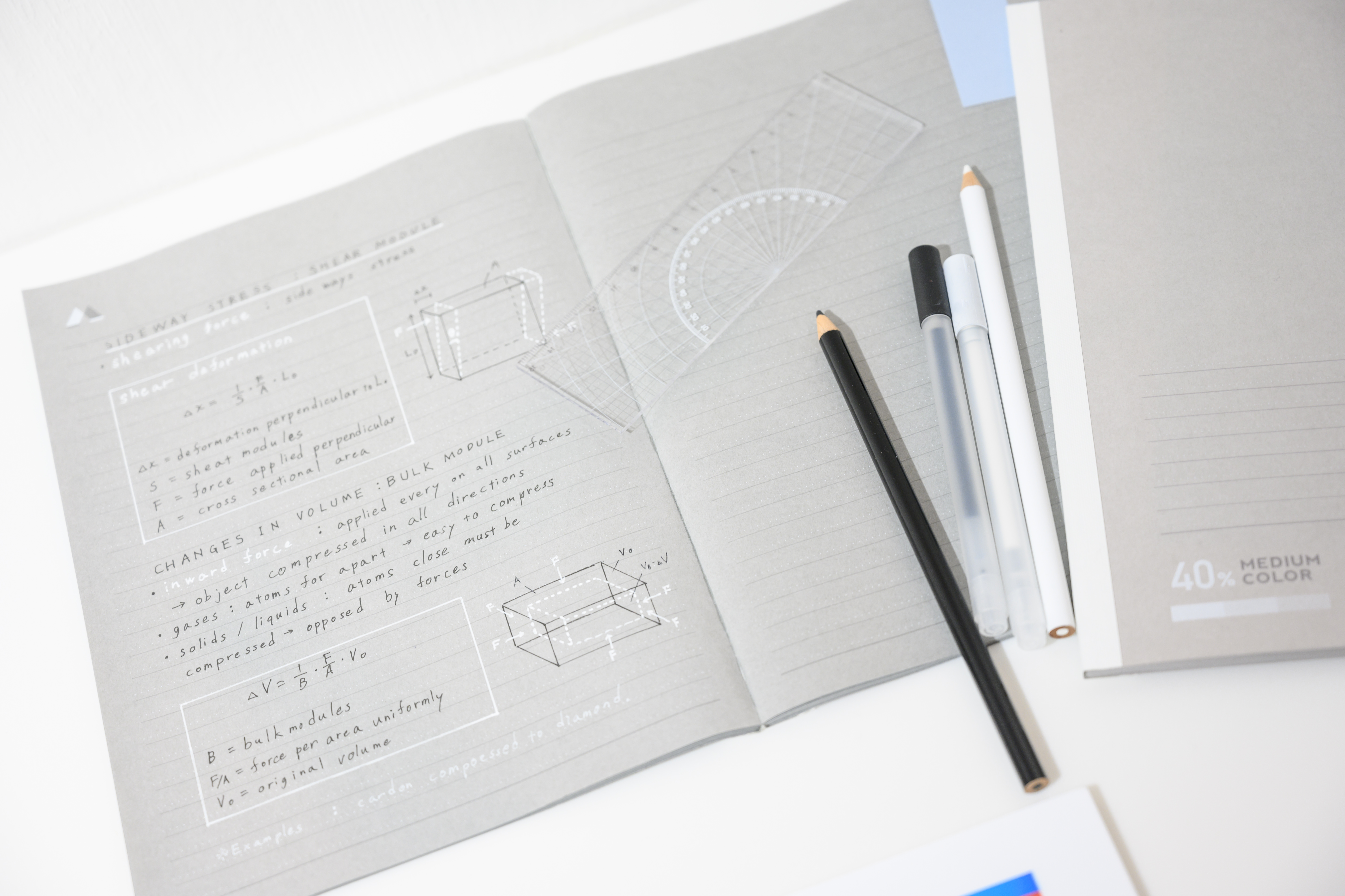
Monochrome Notebook
This year, the theme of the design award further breaks the boundaries of languages and territories. Adopting the universal sign ‘♡’ as the foundation of communication, participants are invited from around the world of different cultural backgrounds to define what the sign means. It is incredible to see a brand like KOKUYO which adopts a practical vision to bring the best out of every design. Submit your work before October 18th, be one of the changes to better the world.
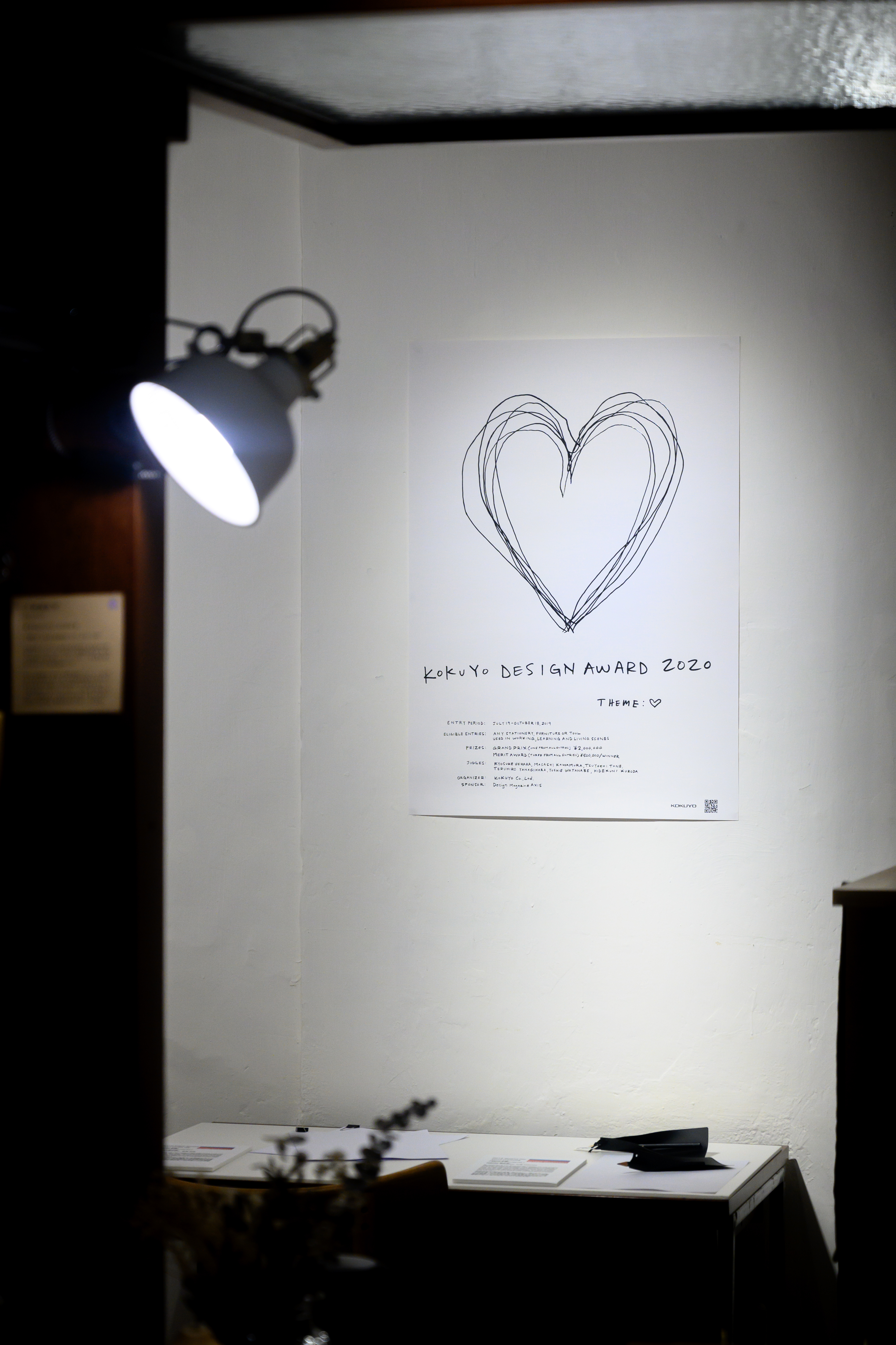
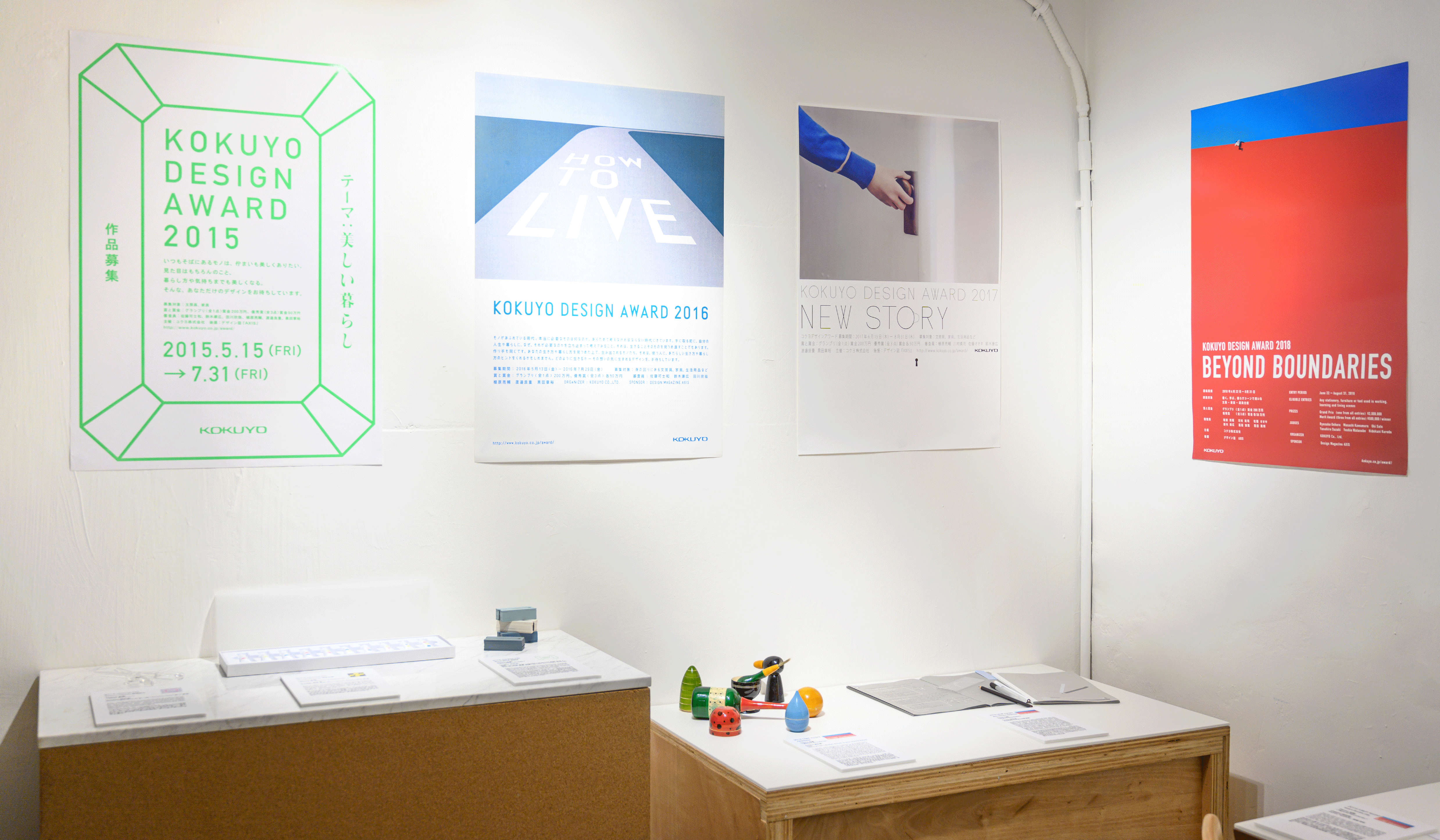
MIDWAY × KOKUYO Design Award
- Time:Now till 10-Oct | Wed - Sun 1 - 7pm(Closed on Mon & Tue)
- Address:MIDWAY shop G/F, 132B Ki Lung Street, Sham Shui Po, KLN

