Design Feature #33
A dose of Uplifting Design
Design in Children's Hospital
Written by RMM
Photos by ©Jill Tate, © Ward + Robes, Starlight Canada, © Daub, © JWT, © Yanko Design
A child in a hospital has little respite. Often, he or she has to face a battery of tests – a never-ending scene of prodding needles and scratchy hospital gowns. When all a child wants to do is play outside and be normal, the clinical design of most hospital wings doesn't inspire much comfort, even if there are token cartoon stickers and childish colours and geometric shapes littering the walls.
Many people, like design historian Victor Margolin, believe that “purpose of design is to the creation of a good society” or that design should “facilitate life” (William R. Miller). So what is the value of design in a hospital environment? Can something beautiful actually solve a problem and help children, in their most dire straits, feel better? Designers shouldn't over-indulge themselves with the superficial aspects of design at the expense of addressing the actual problems at hand. Or worse still, deem something like healthcare design to be a 'lesser' discipline. The effects of good design in a hospital setting are felt not only by children but by their caretakers and medical professionals as well.
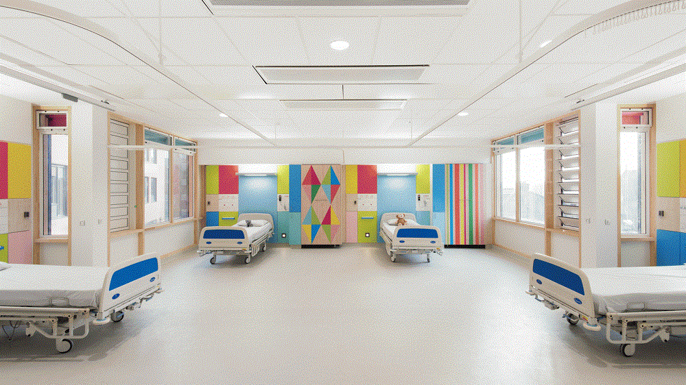
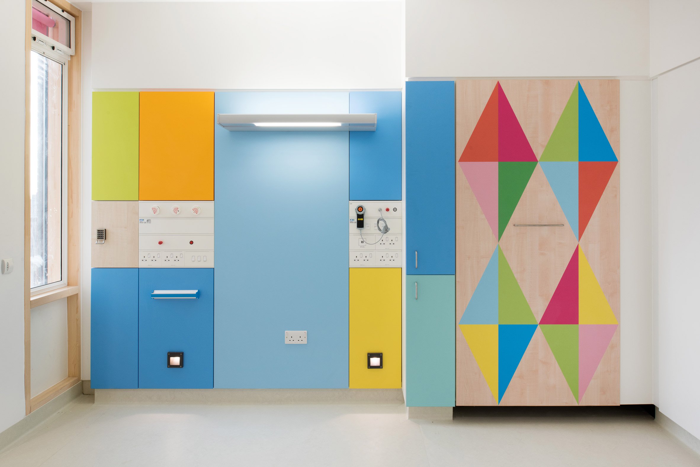
The revamped interiors of the Sheffield Children's Hospital is a good example of how designers can breathe life into hospital wards. British designer Morag Myerscough transformed drab interiors into rainbow wonderlands while working under strict clinical regulations. Festooned with bright colours and harlequin prints, there isn't anything childish about these children's wards. In fact, they're meant to feel comfortable and domestic, allowing children to feel a sense of familiarity despite being in an unfamiliar situation.
Myerscough had to give careful consideration to patients of all kinds, as well as staff. For example, a paler colour scheme was adopted in certain rooms that catered to children who had an intolerance to bright patterns. These rooms are also suitable for older children as well, who might not feel comfortable around childlike pop colours. For hospital staff, the Formica panels used throughout the hospital are easy to clean and sterilise.
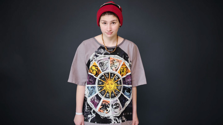
For older children and teens, a friendly and colourful atmosphere might not be enough to lift their spirits. So Starlight Canada came up with a brilliant idea to brighten up their lives: partner with top designers to create unique hospital gowns that teenagers would be proud to wear — allowing them to express their individuality (as opposed to soulless hospital gowns that all look the same) even in the hospital.
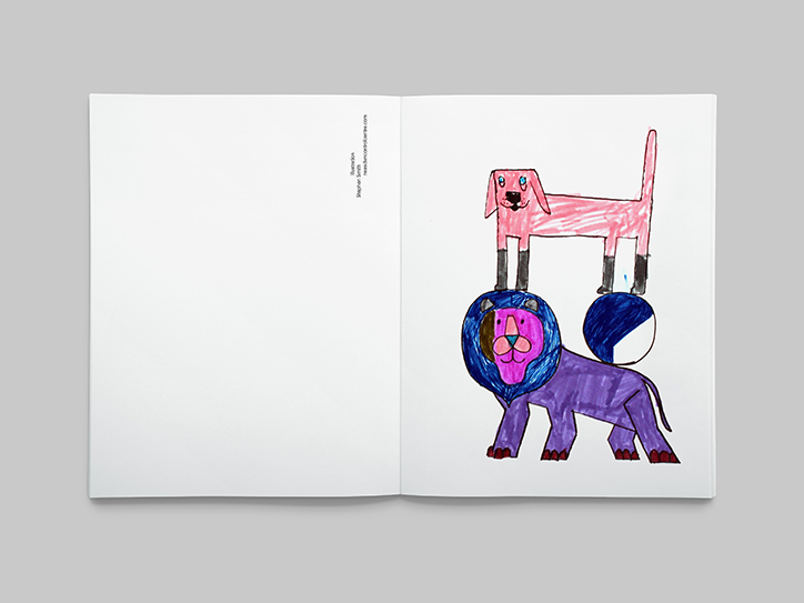
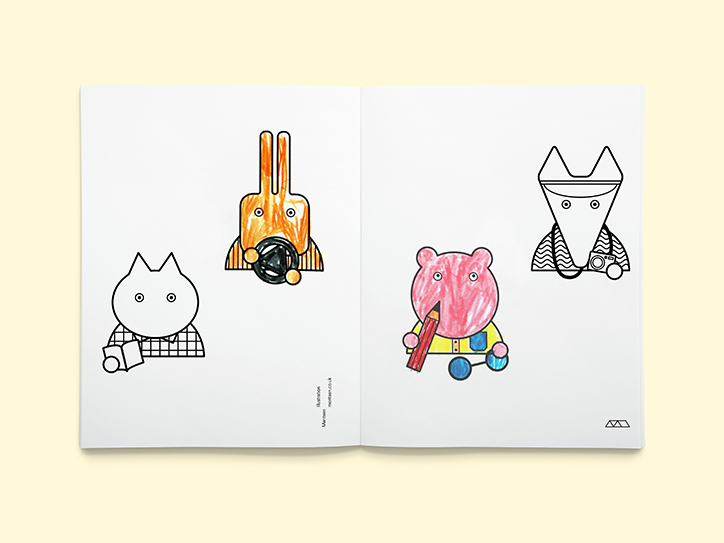
Sometimes, the most uplifting design ideas come from personal experience. Design director David Bennett came up with Daub, a creative workbook for warded children, when his son was admitted to Kings College Hospital. Bennett noticed that the children there only had a couple of books to alleviate their boredom while waiting. He eventually developed Daub which features illustrations by famous illustrators (think Louise Overgaard and Jean Julien) that could be coloured in. The parameters were simple: each artwork had to fit within specific dimensions and only use black lines. Over 300 books were distributed during its pilot run.
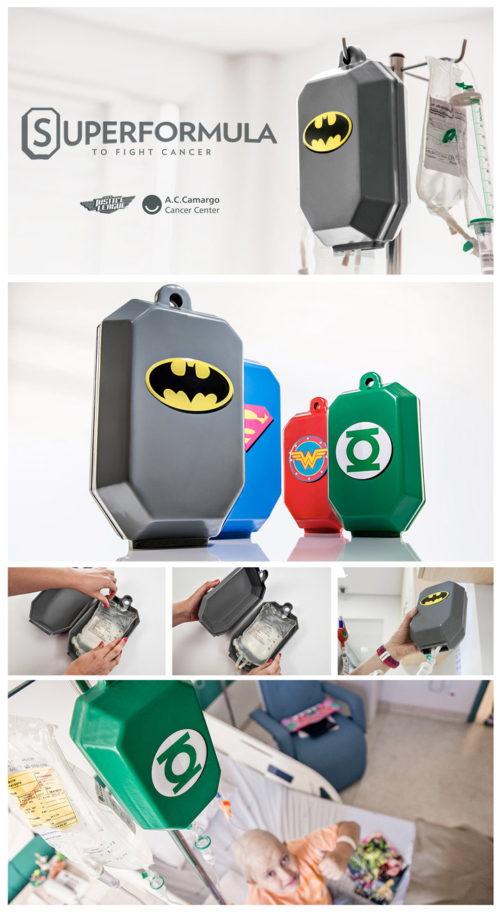
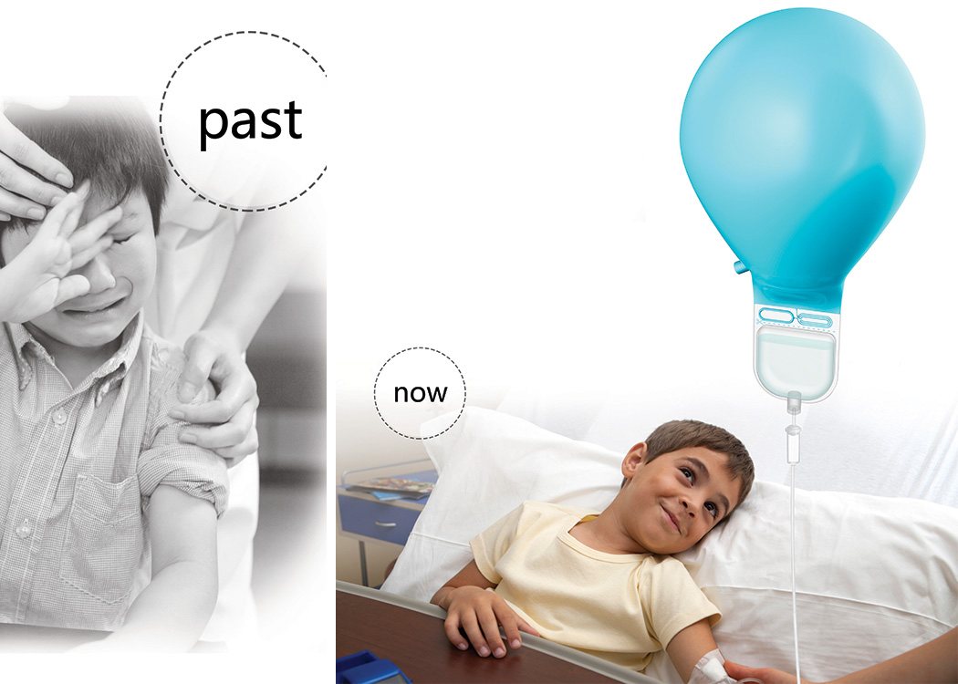
And then there are the examples where uplifting design can even permeate something as cold as medical equipment. Advertising agency JWT collaborated with a cancer ward in Brazil to develop the Superformula project: a holistic programme which aims to help kids handle the arduous process of cancer treatment a little better. By dressing up the IV bags of chemotherapy in Superhero covers, cancer-stricken kids offer inspiration and most importantly courage. It's also a bonus that the covers are easy to clean and sterilise too! Yanko Design's Infusion Balloon works on a similar insight, combining joy and therapy in a simple package.
Do designers have the prerogative to help make the world a better place? Well to be honest, no. But if we can put our creativity to good use and help kids feel better, then why not? All it takes is a little empathy like the examples above and you might create something that could change someone's life.


